Vertical advertisements
Vertical advertisements
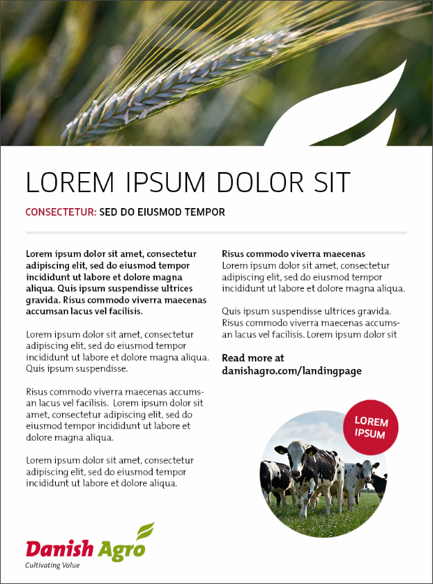
The premise for the group's advertisements and marketing is to offer the farmers the products and services needed at a modern farm and to show that we create as much value as possible for the farmers we work with.
In other words, every day we work to fulfil the needs of our owners and customers to the best possible effect.
To support this, the logo with the group's payoff, Cultivating Value, shall always appear in the advertisements.
The trademark sets the standard
One of the cornerstones of the group's advertising is our trademark - the two leaves that represent growth, development and progress and provide a visual link to our industry. Therefore, the grid on which the ads are build is based on the size of our trademark and the respect distance that must be around it.
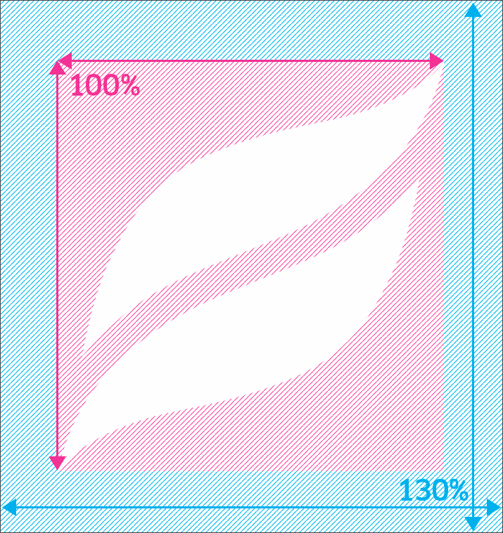
As a general rule, there must always be 30% air around the group's trademark. In practice, this means that our trademark is displayed at 100% with 130% respect distance around it.

The grid
The trademark shall be placed first, because of the importance of the recognition and branding. As mentioned above, the trademark shall have a respect distance of 130% around it.
Size of the trademark
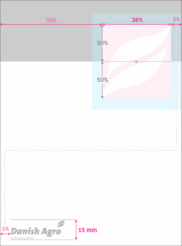
When working with vertical ads the trademark shall have a width of 38% of the ad - for example 50 mm on an 131 mm ad – and placed top right. Because of the respect distance on the right side of the trademark, the margin width on the right shall be used all over.
That means that the margin of 6% of the width of the ad shall be used on both top, right and left side, placing the logo 8 mm from the right, if the ad has a width of 131 mm.
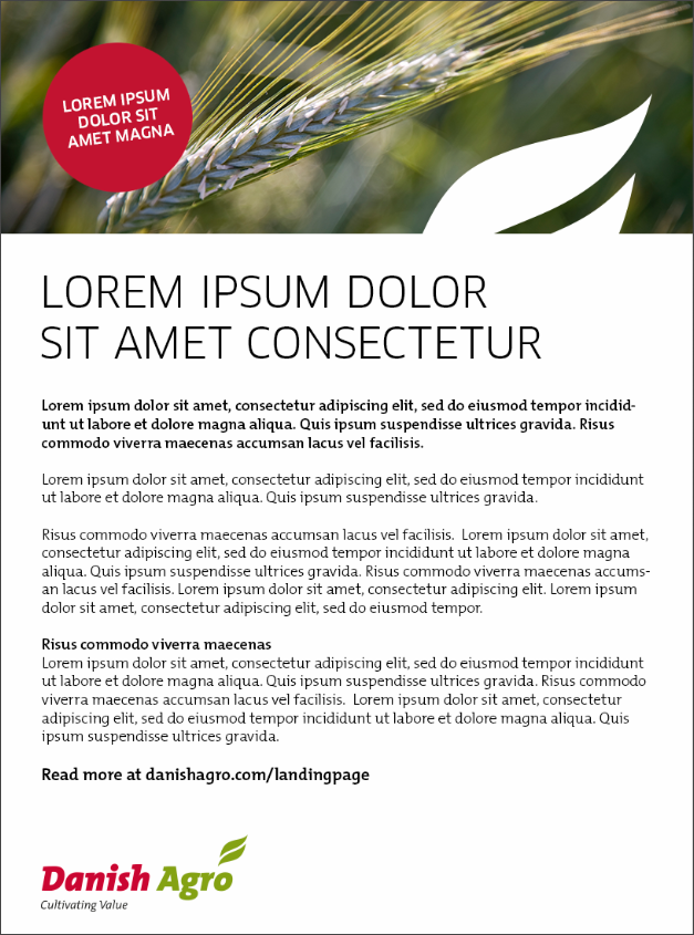
The trademark shall be placed vertically, so the upper 50% covers the top picture. The trademark shall only be shown in 100% white - never with transparency.
Logo
When working with ads the logo with Cultivating Value shall have a height of 15 mm. The logo shall be placed with the same distance to the left side as the trademark has on its right side - 6%, which in this case also is 8 mm.

Fonts
Clan Pro Regular and The Mix B Light are the primary fonts used in the branding of the Danish Agro group.
Both fonts can be used together in the same context as heading and body text respectively.


Margins
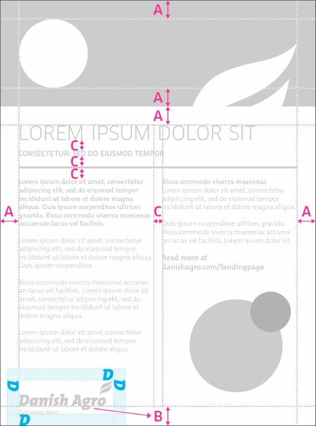
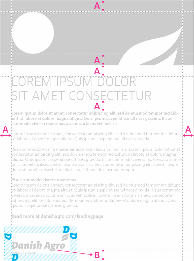
When placing the trademark as mentioned above, the right margin occurs. This measure in millimeters shall be used as margin in both top, left and right (A) as well as vertical space between each element in the ad.
In the top, the splash can be used for communicating a special statement - but it is not a requirement. The splash can be as big as the margins (A) on the top picture allows.
The margin of the bottom (B) depends on the logo and shall be placed to level the bottom of the logo letters - meaning that it has different size in millimeters than the other margins.
Distance around the logo
The logo shall have a minimum distance around it, equivalent to the height of a capital letter.



Two columns
As mentioned under 'Margins', the splash can be used for communicating a special statement - but it is not a requirement.
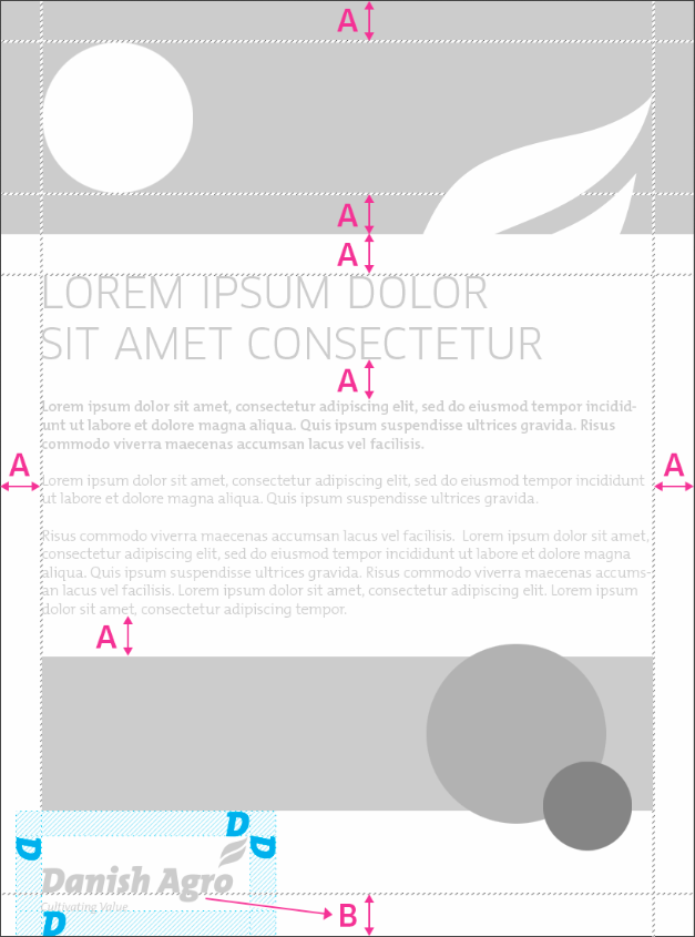
The basic grid consists of A and B. The space between the columns (C) is found by taken the measure of A and divide it by 2. In this case it is 4 mm (6% of the width of the ad, divided by 2).
C is also used as vertical space between each element, if the ad has a small subheading and a line. If not, the measure of A shall be used, like shown under 'Margins'.
A bridge to the product sheet
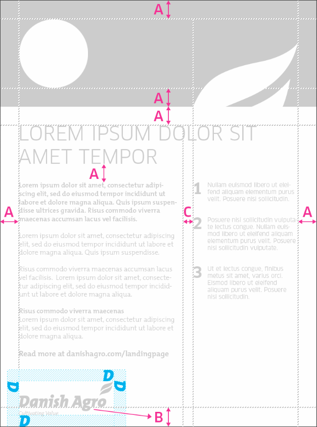
Beside the classic 50-50% division, the ad can also be divided with a grid that looks like the one used on the product sheets to get a more recognizable look across the marketing material.
As shown below the right column get its width from the width of the visible part of the half trademark (not the complete trademark).
